SOUTH DAKOTA HEALTH PLANS ANALYZED
Apr 29, 2015 living South Dakota health insurance
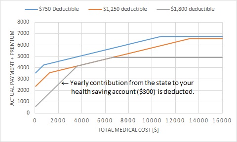
Out of an experimentalist’s habit, I compared with graphs the three health plans provided to employees by the state of South Dakota. The assumed scenario is a middle age (30~39) couple with 2 or more children, one of the family member needs most of the medical care, and the premium is paid in 12 pay periods. I wanted to find out how much they have to pay by themselves annually (y-axis) given different total medical care cost (x-axis). The result came as a surprise to me and most of my colleagues:
The $750 deductible health plan, sold as the best option, is actually the most expensive one; while the $1,800 deductible plan, which only kicks in after the family pays more than $3,600, is surprisingly the cheapest one. And this result holds true no matter how much medical bill one has to pay.
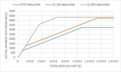
Think twice, and this is easy to understand. One needs to pay more premium to be entitled for the plan with the smallest deductible. Without taking into account the premium, the $750 deductible plan is in no double the best choice, as shown in the bottom plot. If you add up the annual premium to each plan, respectively, the $1,800 deductible plan becomes the cheapest, as shown in the top plot. Note that, if the state does not contributes $300 to the $1,800 plan, the $1,250 plan would be $300 cheaper in the region around $4,000 to $6,000. With this $300 deducted, the highest deductible plan becomes the cheapest in all region.
I did not analyze other scenarios, but it is fairly easy to generate similar plots for other scenarios using a spreadsheet program. The important message here is that plots help you understand data, in physics or in daily life.
Activities mentions in this site have been supported by the following grants: